
Rethinking Highspot's product experience
For several years, we had been hearing the same thing in closed/lost conversations: Highspot's product experience felt dated.
- Role
- Design Lead
- Hackweek team
- 1 designer · 2 frontend engineers · 1 PM
- Initial exploration
- ~2 weeks design · 3-day Hackweek build
- Impact
- +14 NPS
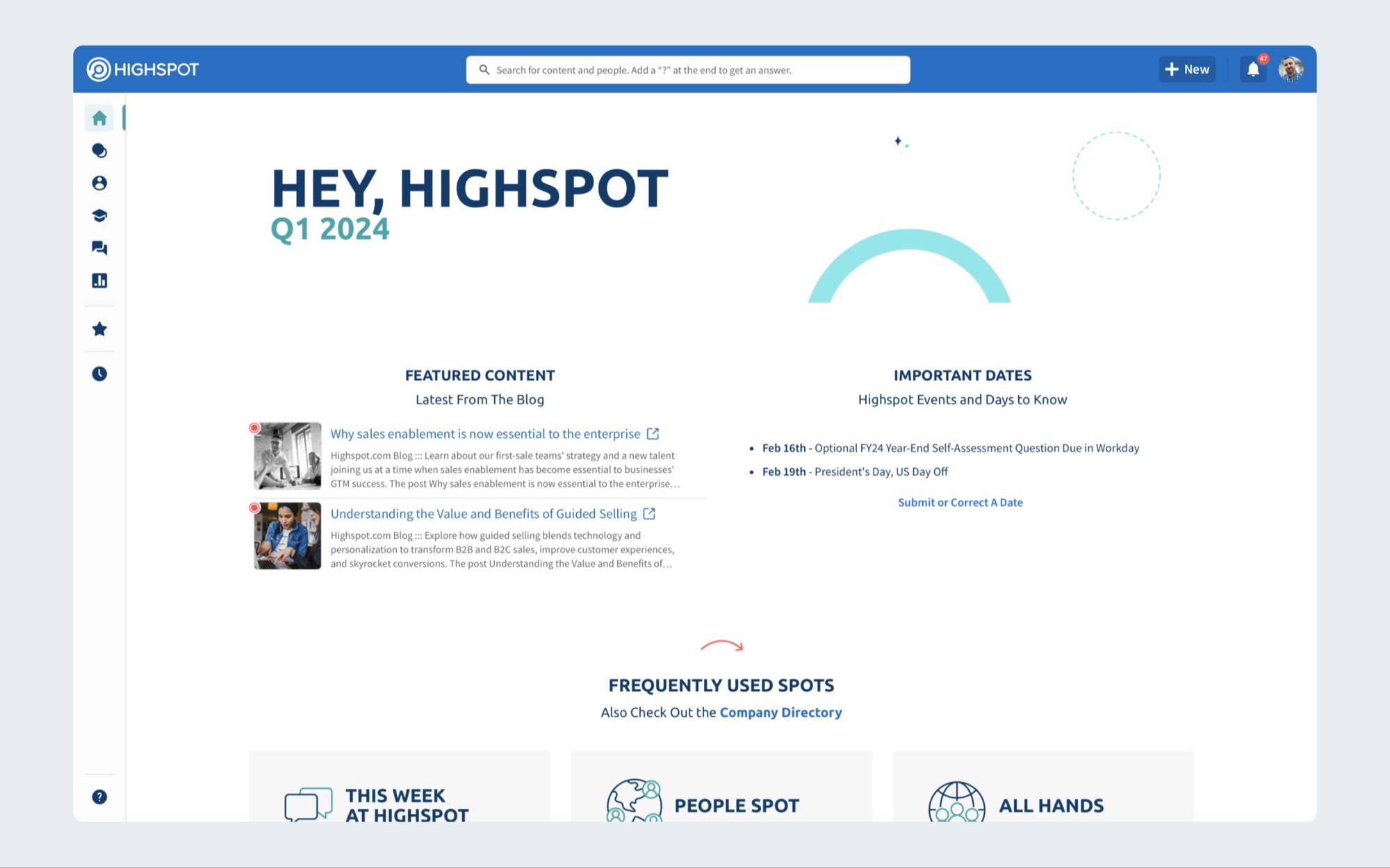
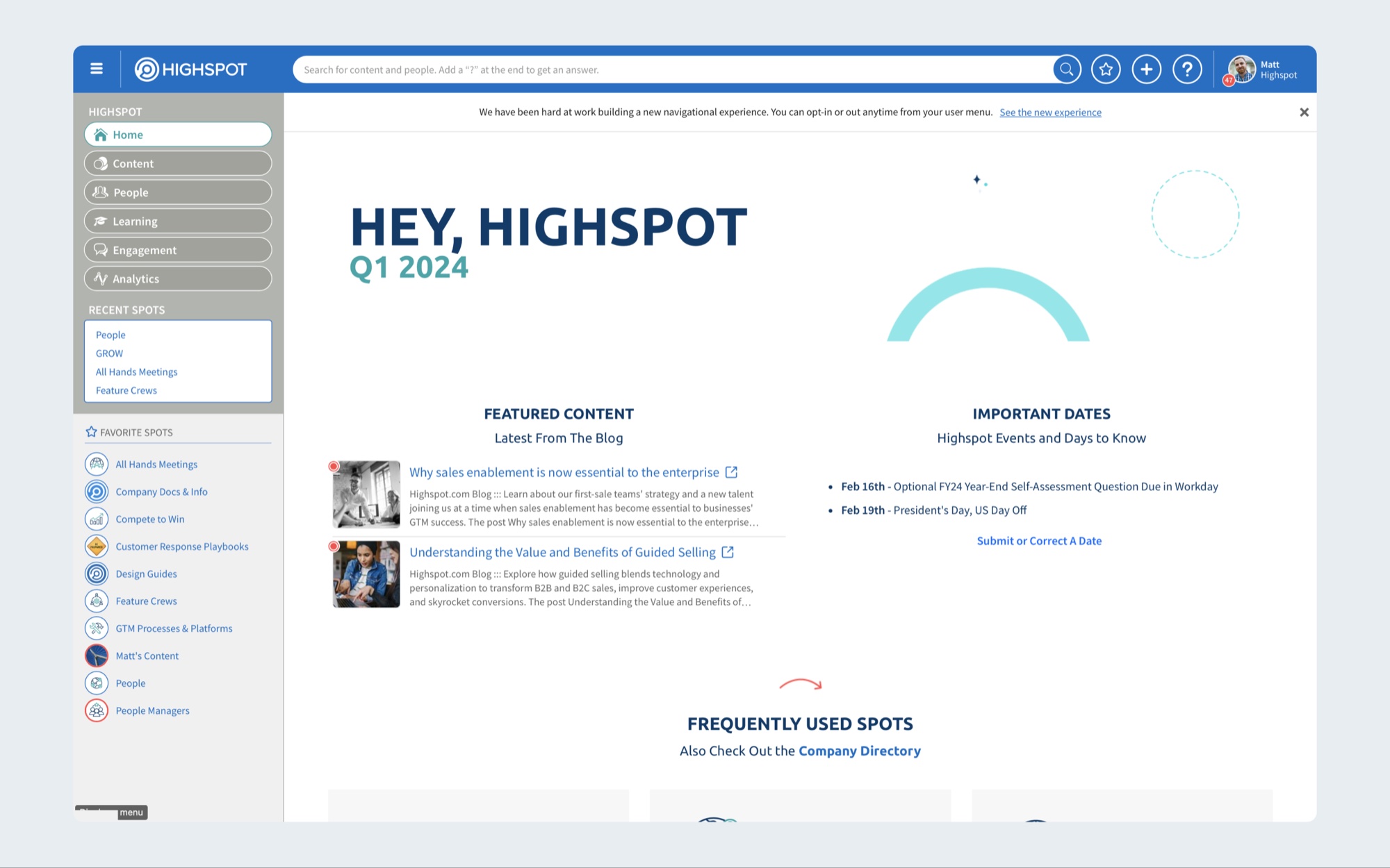 BeforeAfter
In some cases, customers explicitly cited the interface as a reason they chose a competitor. Over several years, those losses represented more than $2M in potential business.
We knew visual design wasn't the only reason customers chose a product, but the feedback was consistent enough that we couldn't ignore it.
I had already been exploring a new direction based on what we were hearing from customers. Hackweek gave us an opportunity to turn those ideas into a working product and prove how much of Highspot we could improve without rebuilding the platform underneath it.
That experiment became Seagull — and eventually Highspot's official product refresh.
The Problem
Highspot had evolved significantly over the years, but the interface hadn't always evolved with it.
New capabilities had been added across different parts of the product, creating increasing visual density, inconsistent interaction patterns, heavy use of iconography, and interfaces that didn't always give customers a strong sense of where they were or what deserved their attention.
More importantly, this wasn't just an internal design critique. Customers were telling us directly.
Feedback from Sales showed that the dated experience had contributed to more than $2M in closed/lost opportunities over several years.
The opportunity wasn't simply to make Highspot look newer. It was to create an experience that felt clearer, more intentional, and more competitive — while proving we could make those changes without introducing years of engineering work.
Starting with Hackweek
I organized a small Hackweek team around a design direction I had already been developing from customer feedback.
The team consisted of myself and two frontend engineers, with product support. In roughly two weeks I defined the initial redesign, and during the three-day Hackweek we turned it into a working implementation.
We intentionally focused on changes that could dramatically alter the perception and usability of the product while requiring relatively small changes to the underlying application.
That was an important part of the experiment. We weren't proposing that Highspot stop everything and rebuild the product — we were demonstrating how much value we could create by improving the shared layers that already connected it.
The project won Highspot's internal “Invent the Future” Hackweek award. More importantly, the working prototype gave leadership something tangible to react to.
From Experiment to Investment
The Hackweek project demonstrated that the refresh could have a much larger footprint than the size of the initial engineering investment suggested. Leadership greenlit the broader initiative.
What began as a visual refresh also helped demonstrate the value of investing in the shared foundations underneath Highspot's product experience.
That eventually contributed to the creation and expansion of our Shared UX team, which Foundations led alongside engineering and product leadership. Our charter extended across the product wherever shared interface problems existed, including mobile.
Over the following year, the team expanded to include another designer and eight additional engineers.
The refresh had become more than a project. It helped establish a team responsible for improving the shared experience of the platform.
More Than a Visual Refresh
Seagull began with visual design, but the work quickly exposed deeper experience problems.
As we reconsidered Highspot's major surfaces, we started questioning how much interface users actually needed, where controls belonged, how navigation communicated location, and how different layers of the application should interact.
That led to changes across four major areas.
Header
The existing header had accumulated actions and controls over time.
We reduced its visual footprint, reconsidered which actions deserved permanent visibility, and created more focus around the things customers used most frequently.
Search remained prominent, while lower-frequency actions could move into more appropriate locations. The result was less competition at the top of every page.
Navigation
Navigation needed to do more than provide a list of destinations. It needed to give customers a stronger sense of place within Highspot.
We introduced clearer selected states, simplified the navigation structure, reconsidered the role of iconography, and explored interaction patterns that allowed navigation to expand contextually when needed.
This work eventually contributed to a broader experience-layering framework within our design system — defining how persistent navigation, contextual surfaces, viewers, panels, and temporary interactions should relate to one another.
Page Headers
Page headers had also evolved independently across the product.
We created shared patterns for page identity, controls, actions, filtering, and sorting so customers didn't have to relearn the structure of a page as they moved through Highspot.
Reducing unnecessary avatars and iconography gave the content more room while creating clearer hierarchy between page identity and available actions.
Content and Cards
Highspot is fundamentally a content-heavy product, so improving the way customers scan and understand large collections of information was critical.
We standardized card structures, improved readability, expanded useful click targets, reduced unnecessary branded color, and created a shared results area for sorting, filtering, and actions.
Instead of every product area creating its own version of these patterns, they could increasingly rely on shared solutions.
Building the System Underneath It
A product-wide refresh couldn't succeed if every team recreated the designs independently.
My Foundations team owned the broader design implementation after Hackweek, translating the visual direction into a complete Figma design system and working with product-area designers to apply the patterns within their features.
At the same time, engineering began componentizing the platform around shared interface components.
This was critical to the long-term strategy. Seagull wasn't intended to be a one-time coat of paint — the design system and shared component architecture gave us a mechanism for keeping the product aligned as it continued to evolve.
The same approach extended to responsive experiences and mobile, which were also part of our Shared UX charter.
Creating Layers of Experience
One of the more important outcomes of the work wasn't purely visual.
As we reduced clutter and reconsidered navigation, we needed a clearer model for where experiences should live. Not every interaction deserved another permanent navigation item, full page, modal, or toolbar action.
That led us toward a layered UX framework within our design system.
Persistent product navigation established the customer's overall location. Contextual surfaces could provide information related to the current area. Viewers could create focused experiences around specific objects. Temporary layers could handle transient interactions without pulling users away from their work.
The framework gave designers and engineers a shared way to think about interface hierarchy instead of solving placement independently within every feature.
The Outcome
Once the refreshed experience reached beta customers, we had one particularly meaningful quantitative signal.
Customers using the refreshed UI reported an NPS of 58 compared with 44 for customers on the legacy experience — a 14-point difference.
For a project that had begun as a three-day Hackweek experiment, that was significant validation.
But Seagull's impact extended beyond the NPS result. The project helped turn years of customer feedback into an organizational investment. It produced a fully rebuilt Figma design system, accelerated the move toward shared frontend components, established new UX frameworks, and helped grow a Shared UX organization responsible for common product experiences across Highspot.
What started as an attempt to make Highspot feel more contemporary ultimately changed how we thought about building the interface itself.
The refresh wasn't the end product. It became the foundation for what came next.