
A clearer, more focused Zipline experience
Customer feedback made it clear that Zipline's dashboard had become difficult to parse. As the product grew, more content and functionality competed for attention, making it harder for employees to quickly understand what mattered most.
- Role
- Staff Product Designer
- Team
- Design lead · Design director · 2 frontend engineers · Research
- Timeline
- ~1 quarter
- Built on
- ZUI design system
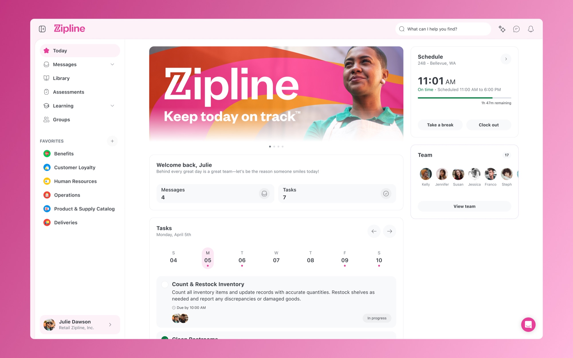
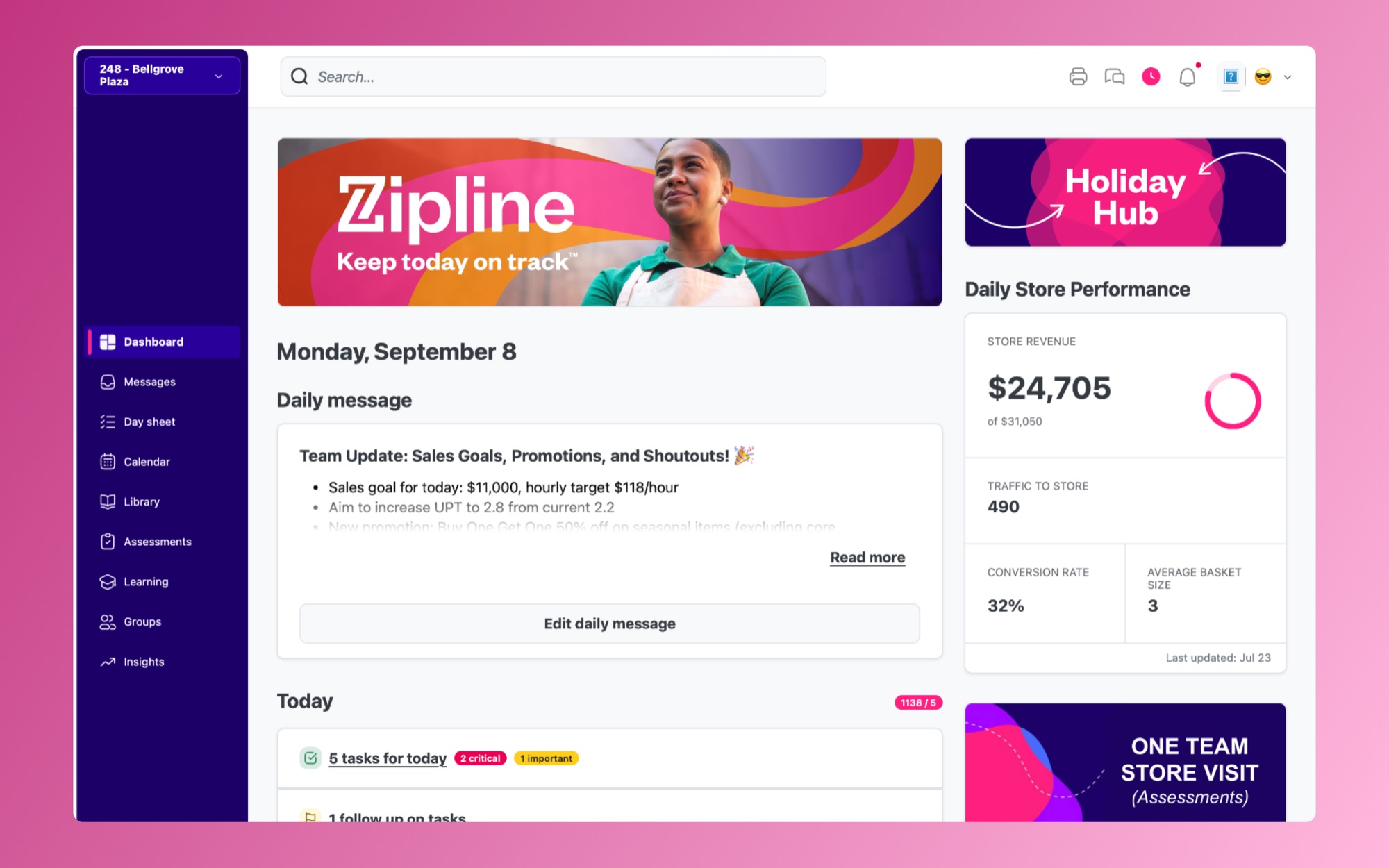 BeforeAfter
With support from leadership, we set out to create a more consumer-focused experience — improving visual hierarchy, readability, and clarity while maintaining the flexibility our customers needed to make Zipline feel like their own.
The Problem
The dashboard is one of the most important surfaces in Zipline. For many employees, it serves as their starting point for the day — helping them understand what they need to know and what they need to get done.
Over time, that experience had grown increasingly dense. Tasks, messages, schedules, company updates, resources, learning content, and other widgets all competed for attention without enough hierarchy between them.
Customers were telling us the experience felt dated, but the larger issue was clarity.
The interface needed to make priority immediately apparent.
What we focused on
- Reduce visual density and cognitive load
- Establish clearer hierarchy between primary and secondary content
- Improve typography and readability
- Create a more contemporary visual language
- Maintain customer branding and customization
- Create a system that worked consistently across desktop, mobile web, and our native applications
Establishing Priority
We already had a strong understanding of what mattered most to our users.
At the center of the experience was the employee day sheet — the tasks and responsibilities an employee needed to complete that day, whether they were working on a retail floor or elsewhere within the company. That gave us a natural starting point for the information architecture.
Instead of treating every dashboard widget with equal importance, we established a clearer distinction between the content employees needed to act on and the content they could choose to engage with.
Primary areas of the dashboard remained fixed and predictable, while additional dashboard widgets could be customized based on the needs of the customer and employee.
The result was a dashboard that made the next action easier to understand without removing the flexibility that made Zipline useful across very different organizations.
The Visual System
The refresh went beyond changing colors or updating individual screens. I developed a new visual language for the product, including an updated type ramp, font family, spacing model, hierarchy, and supporting design system patterns.
Typography became a major part of establishing hierarchy. A more readable font family and revised type scale made it easier to distinguish between page structure, supporting information, and actionable content.
Spacing was also intentionally expanded and normalized throughout the experience. Giving content more room reduced the amount of information users had to parse at once and created clearer relationships between elements.
Together, those decisions made the interface feel lighter without simply removing functionality.
The Dashboard
The dashboard shows the change most clearly.
Previously, a large number of widgets competed within a long scrolling experience. The refresh established clearer priority around the information employees needed most while giving secondary content more appropriate placement within the interface.
Tasks, messages, schedules, and other daily information became easier to identify at a glance. Secondary experiences could move into contextual areas of the interface or customizable dashboard regions instead of competing equally with primary content.
The goal wasn't to make Zipline visually minimal. It was to make the amount of information Zipline already contained easier to understand.
Customer Branding
Zipline is used by many different companies, and maintaining their brand within the employee experience was an important constraint.
Customers needed to continue controlling elements such as their logo and color palette without compromising readability or the new visual hierarchy.
The refreshed system was designed around that requirement from the beginning rather than treating branding as an additional layer applied afterward.
The same principles also needed to translate across desktop, mobile web, and our mobile applications so an employee's experience remained familiar regardless of where they accessed Zipline.
From Design to Implementation
I led the design direction for the refresh, including the visual language, information architecture, typography, font selection, spacing model, design system, and a fully working prototype.
My design director provided ongoing feedback and critique as the direction developed, while research facilitated conversations with customers throughout beta testing.
Once implementation began, I worked closely with two frontend engineers to help translate the new system into the product.
Because many of these decisions affected the underlying structure of the interface rather than an isolated feature, staying closely involved during implementation was important. I helped guide engineering decisions and ensure the hierarchy and system-level principles behind the designs carried through to the finished experience.
Validation
The refresh was introduced through a beta program spanning roughly 40–50 customer organizations.
Rather than relying on a single launch moment, we used the beta to validate the direction and continue refining the experience with customer feedback.
The response was consistently positive. Customers and internal stakeholders responded particularly well to the updated visual hierarchy and repeatedly described the dashboard as easier to parse. The new direction made it easier to understand what required attention while giving the overall product a more contemporary and approachable feel.
While we didn't tie the beta to a specific quantitative usability metric, the qualitative response gave us confidence that the changes were addressing the problems customers had originally raised.
The refresh ultimately established a clearer foundation for Zipline — one that improved the immediate customer experience while giving the product a stronger visual and system-level foundation to build on.